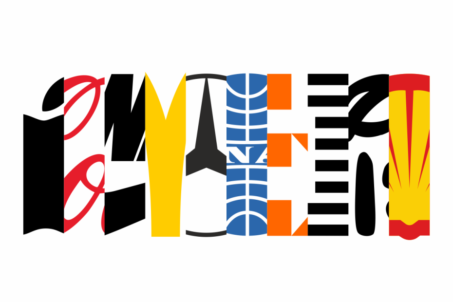
Logos are so much more than just visuals slapped onto a product—they’re stories, identities, and even a slice of culture. Think about it. When you see an apple with a bite out of it, you don’t need any words to know it’s Apple. Or a swoosh? Nike instantly comes to mind. In this post, we’re diving into the logos that have not only shaped brands but influenced our lives in big ways.

1. Apple: The Bite of Innovation
Apple’s logo is minimalistic but so instantly recognizable. Originally, Apple had a more intricate design, with Sir Isaac Newton sitting under an apple tree. But Steve Jobs and designer Rob Janoff agreed that a simpler approach was needed to reflect Apple’s core values of innovation and ease. Today, the logo feels synonymous with tech and modernity. It’s a great example of how a logo can evolve but still carry the brand’s vision.
2. Coca-Cola: A Sip of History
Coca-Cola’s logo is pure classic Americana. Created in 1886, this logo’s fancy cursive font has hardly changed, showing the power of consistency. It’s not just a logo—it’s an icon that’s adapted over time while maintaining its vintage charm. In the advertising world, Coca-Cola set the standard for brand recognition, and that’s what a logo should do: feel familiar, even nostalgic.
3. Nike: Just Do It with a Swoosh
The Nike swoosh is a masterclass in simplicity. Designed by Carolyn Davidson in 1971, it represents the wing of Nike, the Greek goddess of victory. Not only is it sleek and sporty, but it’s become a badge of empowerment worldwide. Nike has shown how a logo can go beyond branding—it’s about culture, sports, and even self-belief.

4. McDonald’s: The Golden Arches of Fast Food
Few logos are as globally recognized as the Golden Arches. McDonald’s logo isn’t just about fast food; it’s about childhood memories, convenience, and a consistent experience. Introduced in 1961, the golden “M” has seen minor tweaks, but the logo remains a beacon for one of the most successful franchises in history.

5. Mercedes-Benz: The Three-Pointed Star of Luxury
The Mercedes-Benz three-pointed star is all about luxury, quality, and ambition. Each point on the star represents dominance over land, sea, and air, fitting for a company that built its reputation on engineering excellence. This logo has become synonymous with status and refinement, showing how logos can embody ideals and aspirations.

6. Pan Am: Flying High with Saul Bass’s Iconic Design
Pan American Airways, or Pan Am, was once a symbol of luxury air travel. Designed by Saul Bass, the blue globe logo became synonymous with sophistication and global reach in the 20th century. Even though Pan Am no longer exists, the logo remains a classic in design history, setting the standard for simplicity and instant recognition in the aviation industry.
7. FedEx: The Hidden Arrow of Precision
FedEx’s logo, designed by Lindon Leader in 1994, is famous for the hidden arrow between the “E” and the “x.” This subtle design element conveys speed, precision, and forward motion—everything a shipping company should represent. It’s a powerful example of how hidden meanings in a logo can add a layer of sophistication and surprise, making it memorable and visually appealing.

8. IBM: The Striped Symbol of Innovation
Paul Rand, another legend in the world of logo design, created the IBM logo in the 1970s with those iconic blue stripes. The stripes suggest “speed and dynamism,” which was forward-thinking for a tech company back in the day. Rand’s work laid the groundwork for modern tech branding, showing how even an established company can use a clean, bold design to stay current.
9. Disney: The Magic of a Signature
Disney’s logo, based on Walt Disney’s signature, is whimsical, friendly, and instantly recognizable. The Disney “D” alone feels magical, connecting audiences to childhood memories and the world of animation. It’s proof that a logo doesn’t always need a modern twist—sometimes, nostalgia is the perfect branding tool.

10. Shell: An Evolutionary Icon in Oil and Gas
Shell’s logo is one of the most enduring in history. The shell shape itself was initially tied to the company’s beginnings as an importer of seashells, but over time, it became a bold red and yellow symbol representing energy, reliability, and accessibility. The simplicity of the logo allows it to stay relevant and recognizable, even in today’s rapidly evolving energy landscape.
Closing Thoughts
These logos demonstrate how great design can make a brand unforgettable. Whether through simplicity, nostalgia, or hidden details, they resonate with audiences and build brand loyalty in powerful ways. The next time you see one of these logos, consider the creativity and strategy behind it—and if you’re inspired to craft your own memorable brand icon, let’s connect at 634 Creative!
