How UK Brands Reinvented Themselves and Thrived
Rebranding isn’t just about changing a logo or color scheme—it’s a powerful way for brands to reconnect with their audience, update their identity, and stay relevant. British companies, in particular, have shown incredible creativity in this area. In this post, we’ll look at some of the most successful rebrands by UK brands, from Burberry’s luxurious revamp to Co-op’s nostalgic transformation.
1. Marks & Spencer: A Fresh Take on a British Staple
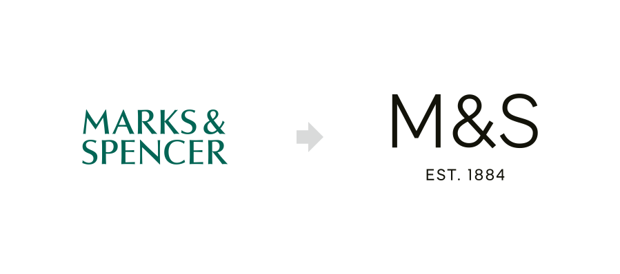
Marks & Spencer, or M&S, has been a staple of British retail since 1884, offering everything from clothing to food. However, facing increased competition, M&S revamped its logo and branding in 2004, dropping “St Michael” and embracing a simpler, more modern look with the tagline “Your M&S.” This rebrand emphasized quality, freshness, and accessibility, especially in its food department, making M&S a leader in premium, ready-to-eat meals. More recent logo refreshes have maintained this simplicity, reinforcing M&S as a reliable brand that resonates with both traditional and new customers alike.
2. Co-op: Nostalgia Meets Modern Values
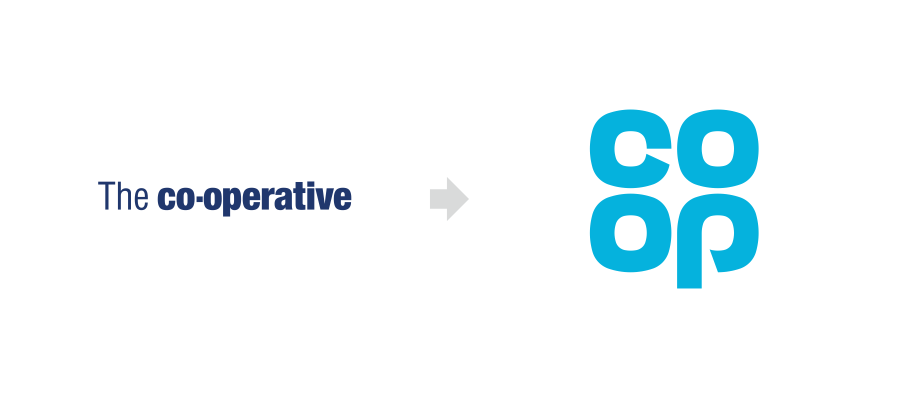
The Co-operative Group, widely known as Co-op, took a clever approach to rebranding in 2016 by reintroducing its 1968 clover-leaf logo. This nod to its heritage resonated with customers who associated the older logo with trustworthiness and community values. The rebrand wasn’t just cosmetic; it reflected Co-op’s commitment to social values, sustainability, and ethical practices. This blend of nostalgia and modern values was a massive success, enhancing customer loyalty and boosting the Co-op’s brand identity as a reliable, ethical retailer.
3. Barclays: Reinventing the Blue Eagle
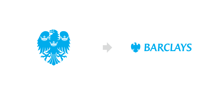
Barclays, one of the UK’s oldest banks, undertook a significant rebrand in the early 2000s to modernize its image and appeal to a global audience. The bank kept its historic blue eagle logo, but streamlined it with a bolder, simplified design. The rebranding extended beyond visuals to reflect a customer-focused approach, introducing the tagline “Now there’s a thought” and updating its branches and online platforms. This rebrand helped Barclays maintain its heritage while positioning itself as a forward-thinking, customer-centric bank, appealing to both long-time clients and a new generation of digital users.
4. Jaguar: From Classic to Cutting-Edge
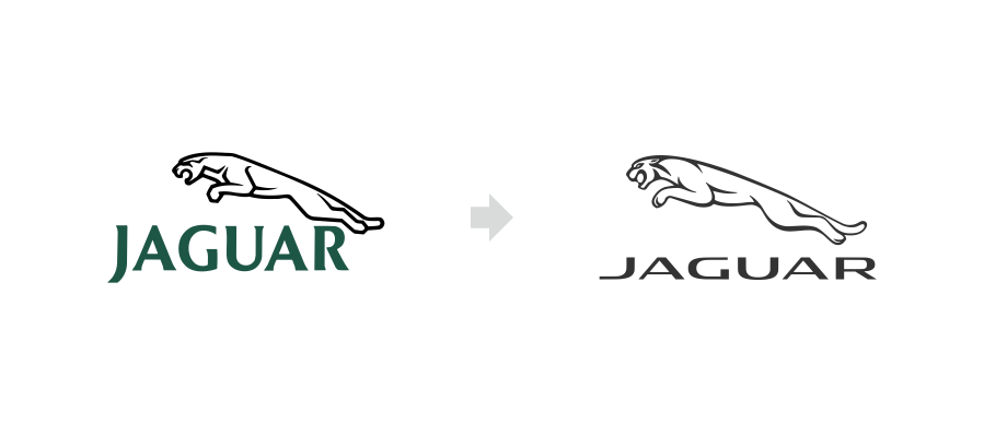
Jaguar, the luxury British car brand, rebranded in 2012 to reflect its shift from a classic carmaker to a leader in innovation and performance. The updated logo featured a sleeker, more dynamic leaping jaguar icon, symbolizing the brand’s new focus on speed, technology, and modern luxury. This rebrand also introduced a darker, metallic color palette and refined typeface, aligning Jaguar with a sophisticated, high-tech aesthetic. The transformation successfully repositioned Jaguar as a forward-thinking brand, enhancing its appeal to younger, performance-oriented car enthusiasts while retaining its legacy of elegance.
5. British Airways: Reclaiming British Pride in the Skies
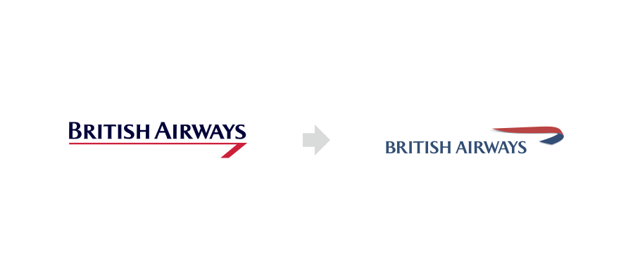
British Airways, one of the UK’s most beloved airlines, revamped its logo and overall branding in 1997 to better connect with global travelers. The “Speedmarque” design introduced a streamlined, red and blue ribbon to represent elegance and movement, all while retaining its iconic British identity. This rebrand positioned British Airways as a premium airline with a distinct national identity, catering to both British pride and international appeal.
6. BP: Green Is the New Black
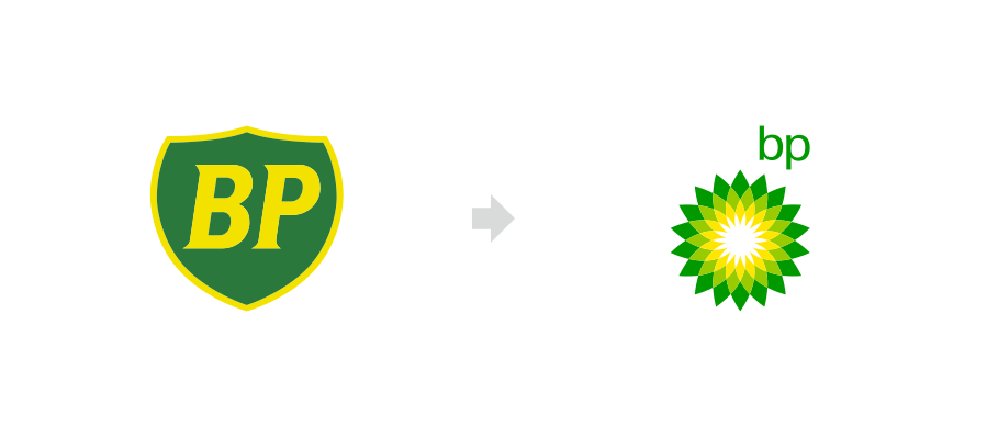
In the early 2000s, BP (British Petroleum) rebranded with a new green and yellow “Helios” logo, symbolizing a shift towards environmental awareness and energy transformation. This ambitious rebrand aimed to position BP as an environmentally conscious company, despite its roots in fossil fuels. Though BP’s sustainability efforts have faced scrutiny, the logo rebrand was successful in sparking conversations and aligning BP with green initiatives.

7. The Guardian: A Digital Transformation
As print media struggled in the digital age, The Guardian successfully reinvented itself by going fully digital in 2018 and introducing a modernized logo in lowercase font. This rebrand embodied the paper’s progressive values and appealed to a younger, online audience. The fresh look helped The Guardian thrive in the online news landscape, setting it apart as a forward-thinking and accessible publication.

8. Penguin Books: A Playful Twist on a Classic
Penguin Books updated its classic logo in 2003, giving its beloved penguin mascot a sleek, modern appearance while keeping the essence of the brand intact. This subtle but effective change appealed to readers who value both tradition and a contemporary feel. Penguin’s rebrand shows that a small, thoughtful update can make a big impact while preserving a brand’s legacy.

9. John Lewis & Partners: A Focus on Partnership
In 2018, John Lewis rebranded as John Lewis & Partners, emphasizing its commitment to employees as partners in the business. The rebrand included a modernized logo and was paired with a fresh, inclusive marketing campaign. This approach resonated with customers who valued the company’s emphasis on ethical business and employee empowerment, solidifying John Lewis’s place as a trusted, people-focused brand.

10. Tate Modern: An Artistic Evolution
The Tate Modern, part of the Tate art galleries in the UK, revamped its logo to a “dot matrix” style, reflecting the museum’s contemporary and ever-evolving art scene. This unique, dynamic design captures the spirit of modern art and allows the logo to adapt across various forms of media, adding a distinctive identity that resonates with art enthusiasts worldwide.
Ready to Transform Your Brand?
At 634 Creative, we specialize in crafting memorable logos and successful rebranding strategies that tell your unique story and set you apart in a competitive market. Whether you’re looking to refresh your existing logo or take your entire brand in a new direction, we’re here to help you create an impactful visual identity.
Get in touch with me for a free consultation and start your rebranding journey with a design that truly represents your business!
