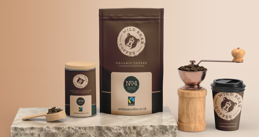
My client wanted some Coffee Shop Branding designing and mocking up. The site is going to be located near a busy London train station. The theme was to be rustic and based around the Bear symbol. The shop will be using only be best Fairtrade coffee and also selling snacks and baked goods throughout the day.
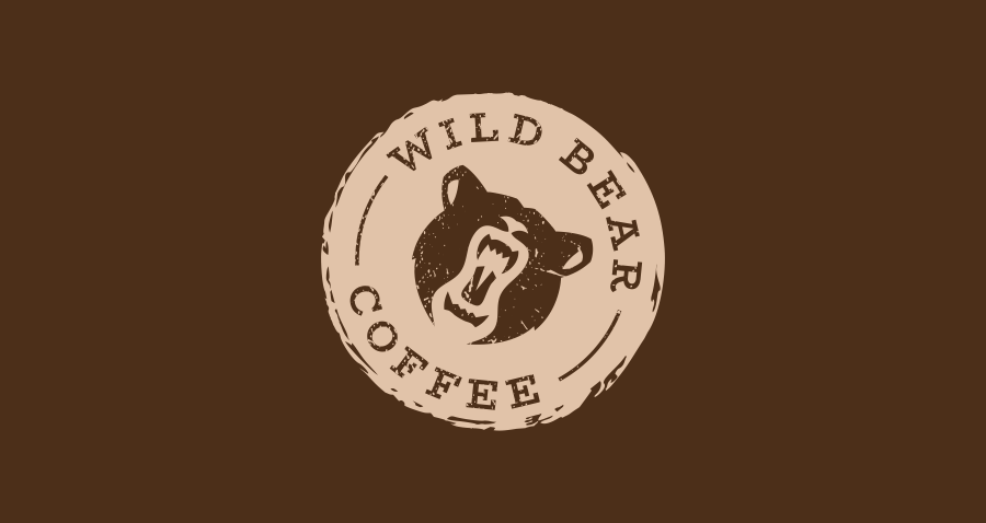
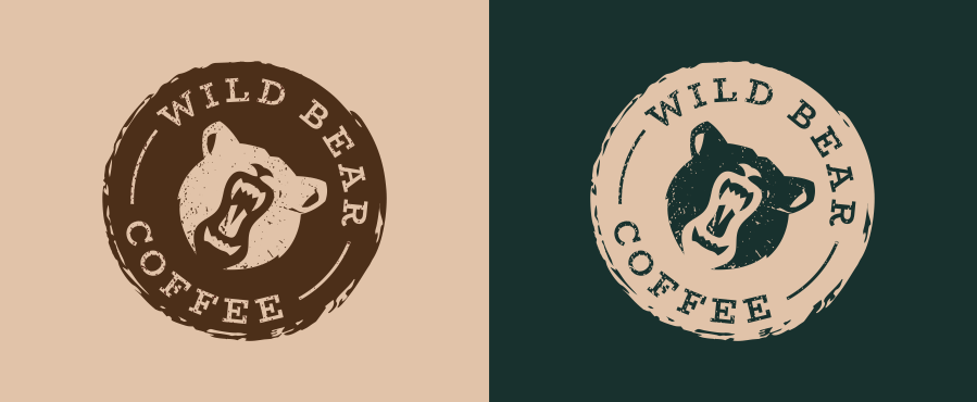
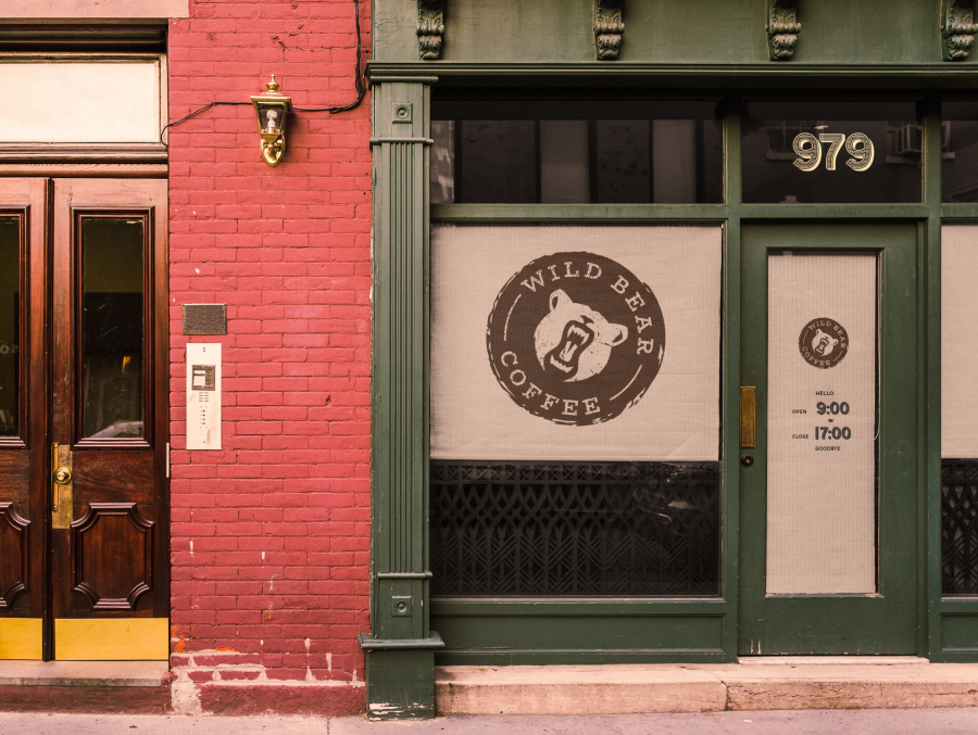
It’s important for the Coffee Shop Branding to stand out and be a little different from it’s competitors. Giving he client some real word examples of how things will look is a huge help on narrowing down the winning design. I always start off my design process by sketching out my ideas. Then I start to digitise my thoughts and get the proofs together before sending over to the client or some feedback. I went with a distressed look for the text as I wanted to give it that worn, well used and loved feel.
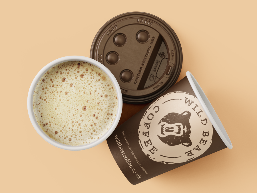
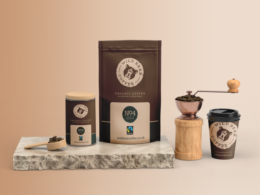
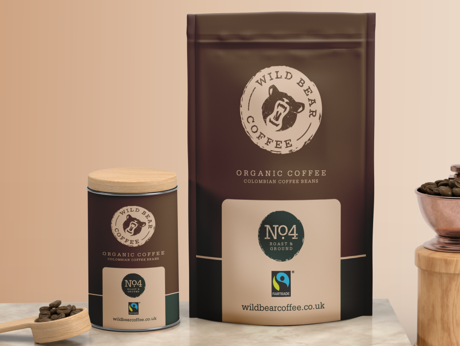
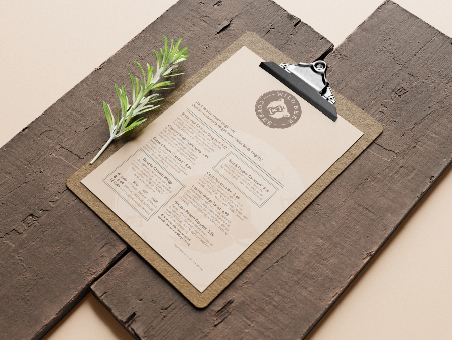
I wanted to give the client an option for selling the coffee bean they use. Mocking this up was another way to show the client the potential of the brand and what else they could offer. Showing the how the logo can be used on various products show’s how flexible the logo can be. I wanted to include a menu design as they wanted to offer a few tables for lunch meals.
If you would like to rethink your company branding or start from scratch please get in touch.
Want a logo that defines your brand?
Let’s make something unforgettable!
Discover the three logo design packages I offer and how I can support your business in creating a distinctive brand identity.
Your logo should stand out and reflect the level of quality your customers expect.
