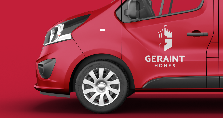
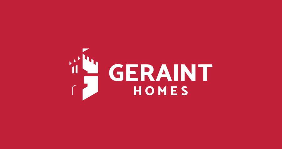
Geraint Homes approached me to do a new construction logo design. The brief was very simple, just how I like them. Masculine, clear with a reference to Wales. Based in North Wales Geriant Homes are a construction company specialising in bespoke housing. Many ideas came to mind initially exploring simplified versions of the Welsh Dragon until we settled on the castle design. Incorporating the G into a castle format for the mark was the way forward.
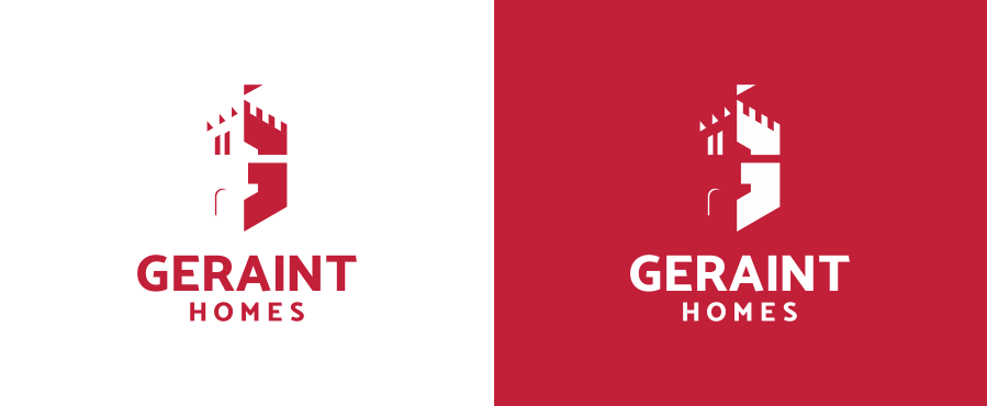
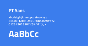
Red was a must for the client when it came to this construction logo design. They gave me free rein to pick the red and ended up with a slightly darker red for the branding. It has a strong look and not too in your face as the true Welsh red would be making it ideal for this project. For the font I went with Mosk, a strong angular font which worked perfectly with the Castle icon. Two different weights within the logo gives focus on the brand name.
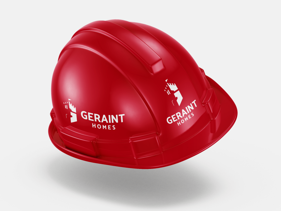
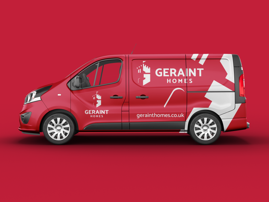
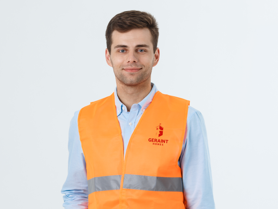
The importance of looking professional with your brand can’t be said enough. It’s the first thing that’s seen with any client communication or interaction. If you have two construction companies in the same area and one has terrible branding and the other very professional, you would always go for the later.
If you would like to rethink your company branding or start from scratch please get in touch.
Want a logo that defines your brand?
Let’s make something unforgettable!
Discover the three logo design packages I offer and how I can support your business in creating a distinctive brand identity.
Your logo should stand out and reflect the level of quality your customers expect.
