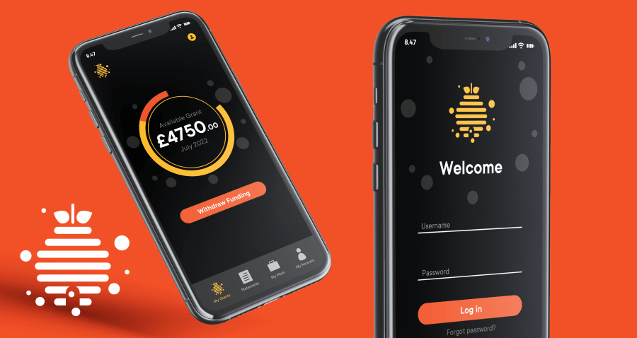
I have really enjoyed working on this Financial Services branding for GrantHive. Given the name they had chosen it was a no brainer to do a design based around a beehive. I included the bee’s as coins to represent the financial theme of the business. I wanted the logo to be very simple with no gradients so it would work well on an app. It had to be easily transferred to an App icon and be a stand along brand for the company.

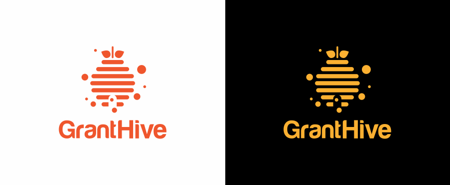
The end product will be an app used for people looking for business grants. Showing how this could look to the client was important. It’s also a good way for the client to see just how the branding will appear in the real world. As more move online and into apps, the Financial Services Branding had to work well in both light and dark themes.
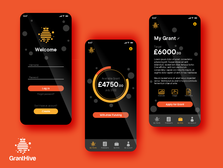
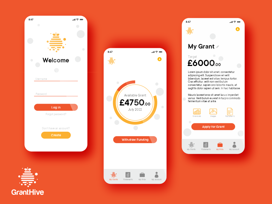
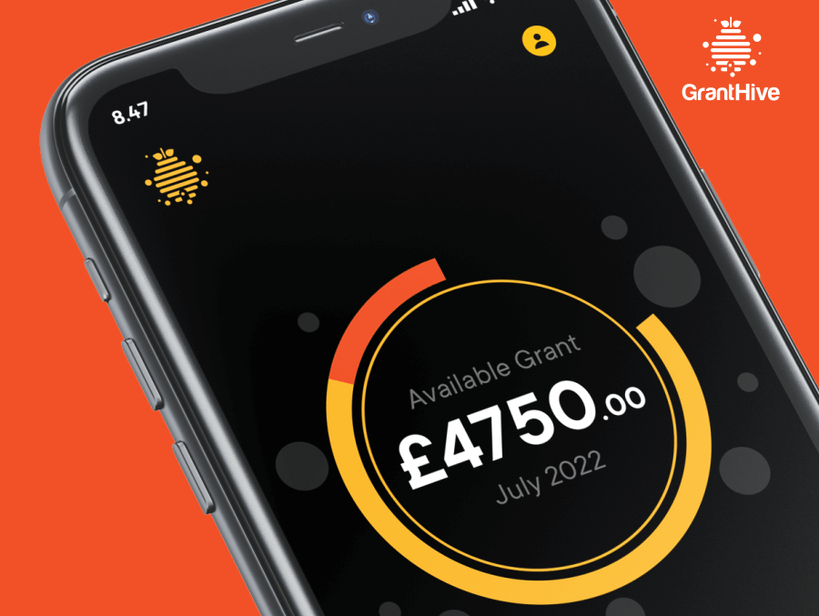
I really enjoyed designing the mock app for GrantHive and showcasing the logo in a digital real world situation. Having too much detail in the logo would hinder the brand in a digital setting. Even with high def screens we all have on our phones, small details can appear blurred.
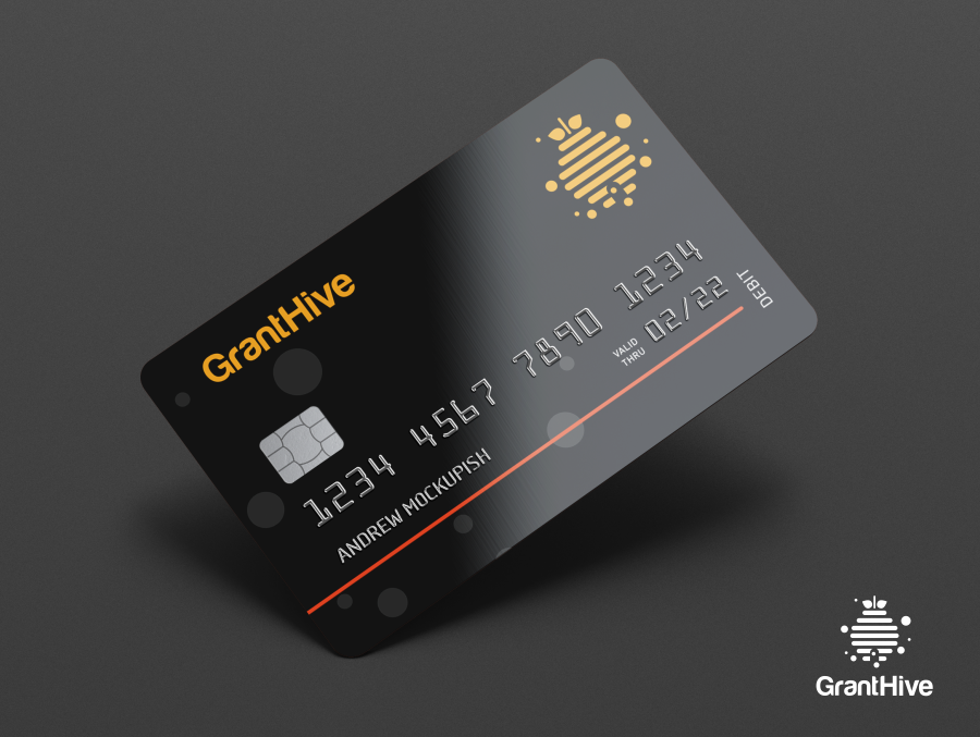
If you would like to rethink your company branding or start from scratch please get in touch.
Want a logo that defines your brand?
Let’s make something unforgettable!
Discover the three logo design packages I offer and how I can support your business in creating a distinctive brand identity.
Your logo should stand out and reflect the level of quality your customers expect.
